Feature contribution by Sean McCarthy, Senior Content Marketing Manager at Lucky Orange
Lots of traffic to your eCommerce store but no conversions? Here’s what you’re doing wrong.
The current state of eCommerce
While eCommerce growth is expected to slow in 2021 after experiencing 10 years worth of growth in just a handful of months in 2020, the future remains bright. That past year exposed gaps in the supply chains of some major retailers, creating opportunities for smaller eCommerce stores.
And while we may see an uneven year or so moving forward, the movement of all generations into purchasing goods and services online means your store should not only be getting traffic, but also driving plenty of revenue.
But what if you’re getting hundreds of pageviews per month and very few conversions?
There is, of course, a long list of things that could be going wrong. In this article, I’ll share a handful of actionable strategies and tests to run that can get you on the right path. Let’s get into it.
Make it easy to buy things on your store
If there’s one mantra eCommerce store owners should live by, it’s to make your store easy to buy from.
And, thankfully, an intuitive store experience is actually a result of doing several basic things really well. Done well, your store’s images and descriptions will do the heavy lifting and your checkout process will be nothing more than an efficient formality.
Convey your unique selling proposition (USP)
When a visitor first lands on your store, what will they see first? No matter if they’re on the home page or a product-specific page, they should be able to quickly understand what you’re selling and if you’ve got a solution for their problem. The top-line messaging that helps convey your offer is called a unique selling proposition. With a USP, the goal is to let the customer know why your product is better than the competition. Of course, along the way you’ll also want to reinforce what the product is.
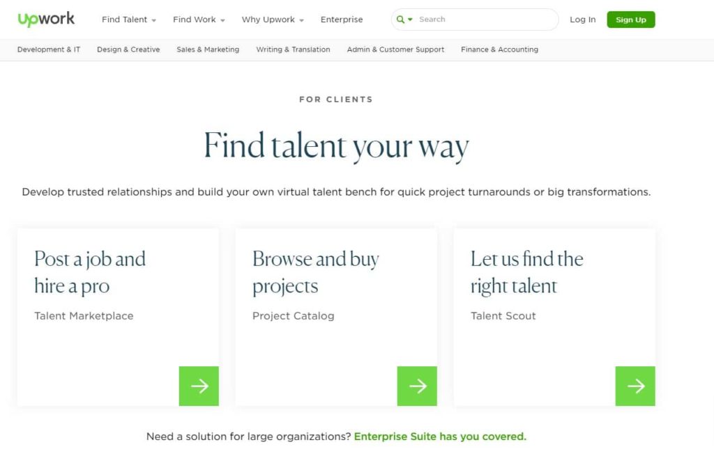
In this example, we can see one of UpWork’s USP messages defining their ability to help you find talent in a variety of ways. If I’m looking to hire a freelancer, I’ll appreciate this type of flexibility and be more likely to jump into their talent network.
Let’s take a look at an e-commerce USP example. For Waterdrop, the message is clear: drink more water. But that’s not a truly unique message. In this case, they offer the “real taste” that comes with using natural ingredients in their products. It’s a simple statement, but one that differentiates them from many competitors who lean on artificial sweeteners and other less ideal ingredients.
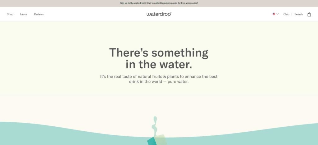
Image source: Waterdrop
Build trust with social proof and icons
When convincing people that your offer is worthy of their time and money, sharing social proof that it worked for others can be extremely powerful. Even simple things like including a testimonial on a product listing or sharing the number of five-star reviews for a product can be the difference between purchase and abandonment.
In this example, Tuft & Needle added an average star rating plus a link to read reviews using the number of reviews for each mattress. While this strategy often pays off, be sure to test before full implementation. Putting such attention-grabbing elements right next to your CTA button can potentially be a distraction that lowers your conversion rate..
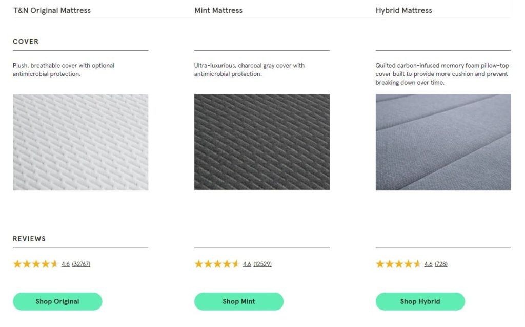
Image source: Tuft & Needle
Optimize call-to-action location and design
For someone to click your CTA, they must see your CTA. Great advice, right? The reality is that depending on your store’s layout, some people may not even scroll far enough to see your most important messaging or your call to action.
A great CTA is:
- Located above the effective fold
- Visually differentiated by font or color
- Clear in what it offers and what it’s asking from you
- Not overwhelming, but always there when a visitor is ready to take action
In this example from video-hosting platform, Wistia, we see four different CTAs in one view. While this could easily be overwhelming when done poorly, they do a great job of making it clear what each button does. Wistia also delivers these CTAs up front and center alongside their simple key message, as the first thing someone sees when landing on their homepage.
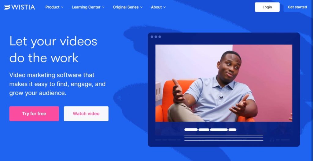
Image source: Wistia
You may notice they have two buttons that accomplish the same thing. Both “try for free” and “get started” take the visitor to a signup page. Remember, every visitor is different and the copy elements they react to will be different. If someone is more concerned about price, “try for free” may be a more attractive copy option.
Curious if your CTA’s are in the right spot on a page? Consider using a dynamic heatmap to see what visitors are really doing on your store. Are they even seeing the products you so badly need to sell this month? Are there certain fields that cause more form abandonment than others? Modern conversion rate optimization tools are designed to answer all these questions and more.
Let your product descriptions do the heavy lifting
There are several ways product descriptions can make a difference for your store.From higher customer engagement on an individual product to easier store searching and SEO benefits, a product description is your chance to differentiate your offer from others.
Here are a few things to consider when writing your descriptions.
First, avoid passive voice wherever possible. Using active voice results in a more compelling and vivid product description. Active voice also generally keeps sentences shorter and more scannable. Scannability should be a large part of your description strategy. Consumers on e-commerce websites move extremely quickly and must be able to spot the information they care about most in a matter of seconds.
Next, don’t forget to lean on other description mediums. Compelling product photography and videos will help people connect your product listing to their own life. Help shoppers understand the top-line value of the product and display it in a way that aligns well with your brand’s overall tone.
Lastly, consider social proof or user-generated content integrations. While these elements will likely be secondary to your own brand messaging, they can provide a great level of support when someone is judging the legitimacy of your business.
Where to start with e-commerce store optimization
This part of your eCommerce journey can get overwhelming. Just remember that you’re not trying to beat Amazon, you’re trying to drive some traffic to your store and convert them to the best of your ability. Here are a few things to take a look at first.
Focus on key pages first
While your store may have dozens of products, focus your optimization efforts on the most high-traffic areas of the site. Do most visitors start on your home page? Do everything you can to optimize them to click into a product page. Are all your mobile visitors using site search? Watch session recordings and optimize around the behavior you’re seeing.
Outsource content development
If you’re to a point where you want to create content around your products development process, materials used or other relevant topics, consider outsourcing. This, of course, is ultimately a math problem. How long will it take you to create the content? What else could you be working on? How much will the outsourced resources cost? Depending on talent level, you’ll likely pay from $20-100/hour for a freelance copywriter. This can be an amazing investment in the long-term success of your store, specifically from an SEO perspective.
Start A/B testing once you have enough traffic
Testing is a huge part of website optimization. But what about websites that are getting low levels of daily pageviews? It might not be worth your time to test if it will take months to reach statistical significance. Don’t worry, if you fall into this category you can still make major gains in your conversion rate.
Your best path forward if you have low site traffic is a conversion rate optimization toolkit that gives you tools like dynamic heatmaps, session recordings, form analytics and conversion funnels. With these tools in hand, you can make highly-informed decisions. You can recognize behavior trends and make small upgrades to the user experience over time.
Conclusion
Becoming a student of visitor behavior is one of the best things you can do if you’re seeking long-term eCommerce success. And while this article can get you on the right path, it’s really about diving into your own store’s data and trusting your instincts. These instincts will get refined over time and you’ll eventually be able to release regular updates that hit the mark and increase conversions.